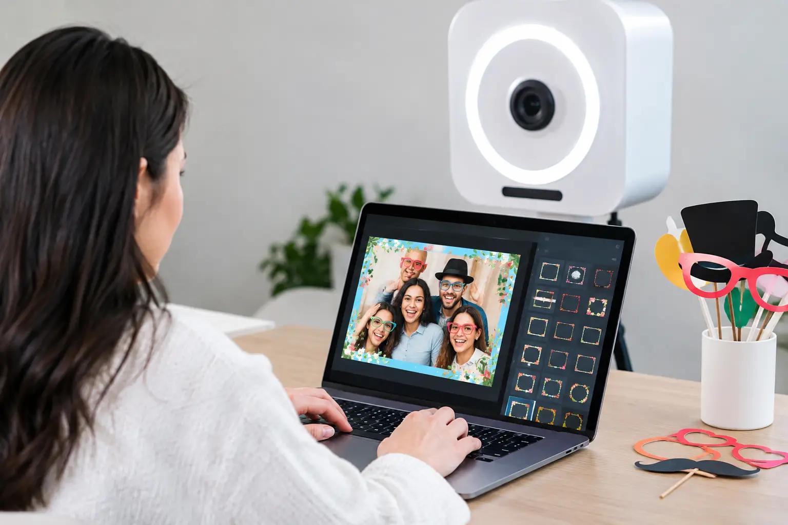
A great photo booth print can become the keepsake guests keep on a desk, tuck into a scrapbook, or post before they leave the venue. When you customize photo booth overlays thoughtfully, every image carries a little more of the celebration with it - the wedding palette, the birthday personality, the company brand, or the beachy feel of a Florida weekend event.
The overlay is the graphic frame, text, logo, and design detail that appears around or on top of each photo. It may seem like a small choice compared with the backdrop, booth style, or guest list, but it does a lot of visual work. A polished overlay turns a fun photo into an event-specific memory. A cluttered one can make even beautiful photos feel dated or hard to read.
Start With the Moment You Want Guests to Remember
Before choosing colors or fonts, decide what the photo should say about the event at first glance. A black-tie wedding may call for a clean ivory border, elegant script, and a subtle monogram. A Sweet 16 can handle bright color, playful type, and a little sparkle. A corporate launch may need a bolder branded treatment that makes the company name clear without making guests feel as if they are posing inside an ad.
This is where event style matters more than design trends. A trendy overlay might look great on a screen, but if it clashes with a vintage walnut kiosk or a romantic floral backdrop, the final experience can feel pieced together. The strongest designs repeat details already present in the event: invitation colors, table linens, floral tones, signage, a logo shape, or a signature phrase guests recognize.
For destination celebrations around Orlando, Cocoa Beach, or Tampa, the setting can guide the look too. A beachfront party does not need seashell clip art in every corner to feel coastal. A soft aqua accent, warm sunset color, or clean palm-inspired line detail often feels more elevated and lets the guests stay at the center of the photo.
How to Customize Photo Booth Overlays Without Overdesigning
The temptation is understandable: there are names, dates, hashtags, logos, colors, icons, and plenty of empty space to fill. But an overlay should support the photo, not compete with it. Guests should be able to see their expressions, outfits, and silly props immediately.
Start with the essentials. For most private events, that means the names or occasion, the event date, and one concise line of personality. “The Garcia Wedding,” “Mia’s Sweet 16,” or “Cheers to 40 Years” gives the print context without turning it into an invitation. If a hashtag is part of the event, include it only if it is easy to read and genuinely being used.
Corporate overlays have a different job. They need brand recognition, but they also need to give guests a reason to share. A logo should have breathing room and enough contrast to remain visible in photos. Pair it with a campaign phrase, product moment, or event name rather than placing logos in every available corner. The goal is branded content that still feels like a photo guests want in their camera roll.
A few design choices make the biggest difference:
- Keep text away from faces, especially in layouts that may crop differently on prints and digital shares.
- Use one or two typefaces at most. A decorative font works best for names or a short phrase, while simple lettering keeps dates and details readable.
- Choose colors with contrast. Pale text on a pale floral backdrop, or dark type over dark photos, can disappear quickly.
- Leave room for personality. A small graphic accent is usually more effective than a full border of competing icons.
- Confirm the print layout before final approval, whether it is a classic photo strip, a 4-by-6 print, or a custom digital format.
The last point is especially useful because the layout changes the design. A vertical photo strip needs a different visual rhythm than a horizontal 4-by-6. Text that looks balanced in a digital mockup may sit too close to the edge once the print is cut. Reviewing a proof helps catch those details before guests begin lining up.
Match the Overlay to the Booth Experience
Not every booth creates the same kind of memory, so the overlay should fit the experience. An enclosed photo booth often shines with classic strips and a graphic frame that feels collectible. An open-air photo kiosk gives groups more room, which may call for a wider design that keeps the border minimal. An inflatable LED booth can handle a high-energy layout with brighter colors and dramatic contrast.
For a 360 Photo Booth, branding usually moves into the video experience. A custom overlay can include the logo, event name, or campaign line within the short-form clip, alongside music and visual effects that match the mood. Since guests may share that content on social platforms, the design needs to be readable on a phone screen. Tiny text and overcomplicated borders rarely hold up once the video is viewed at a smaller size.
The Ultra Social Photo Booth also benefits from an overlay built for sharing. Digital images travel quickly through texts, galleries, and social posts, so use clear words, strong contrast, and a design that looks just as good outside the event setting. Think of it as a miniature piece of event branding that guests voluntarily take with them.
Let the Design Serve the Guest, Not Just the Host
Hosts naturally focus on their vision, and they should. But guests are the ones holding the prints, choosing poses, and posting the results. A successful overlay makes them feel part of something special without making every image feel overly formal or promotional.
At a wedding, that can mean allowing the couple’s names to sit elegantly at the bottom while the top stays open for big smiles and group poses. At a school prom, it may mean using the school colors with a modern layout that feels polished rather than overly mascot-heavy. At an employee appreciation party, it could be a cheerful branded design that celebrates the team instead of centering only the company logo.
Consider the guest mix, too. A milestone birthday with grandparents, coworkers, and college friends needs a design that feels fun across generations. A daytime baby shower may suit softer colors and plenty of white space, while an evening casino-themed fundraiser can carry more drama. There is no single “best” overlay style. The right choice depends on the mood, venue, booth format, and how guests will use the images afterward.
Give Your Designer the Right Details Early
Customization works best when the event details are decided before the last-minute rush. Send the event name, date, colors, logo files if applicable, invitation or mood-board references, and any must-use wording. If the event has a specific backdrop, share that too. It helps prevent a design that blends into the background or fights with a busy pattern.
For corporate teams, provide the approved logo version and brand colors rather than a screenshot pulled from a website. If a campaign has required wording or legal language, identify what must appear on the overlay and what can remain in event signage instead. The more information available upfront, the easier it is to create a design that looks intentional rather than squeezed together at the end.
Orlando Photo Booths can help match the overlay to the selected booth, backdrop, and overall event aesthetic, so the final setup feels like one complete experience. That coordination matters when guests are moving from the dance floor to the booth, grabbing props, posing with friends, and walking away with a print they actually want to keep.
A customized overlay does not need to be loud to be memorable. Give it a clear purpose, let the photos breathe, and choose details that make guests smile when they find that print again months from now.